Getting started
Dashboard & Reports is the read-only layer of blink i — it surfaces what is happening across leads, bookings, payments, and procurement without requiring you to open individual records.
1.3 — Role-based views
What you see on each dashboard depends on your role. blink i shows each user only the data they are permitted to see:
| Role | What they see |
|---|---|
| Sales Agent | Their own leads, follow-ups, bookings and site visits. No cross-agent data. |
| Sales Manager | All agents' performance within their team. Can compare agents side by side. |
| Finance | Collections, payment schedules, expense and procurement summaries across all projects. |
| Founder / Admin | Full cross-project aggregates — revenue, inventory, lead funnel, expense burn — with no restrictions. |
Home Dashboard
The Home Dashboard is the first screen after login. It shows a snapshot of the most important numbers for your role — leads coming in, bookings made, follow-ups due today, and open tasks.
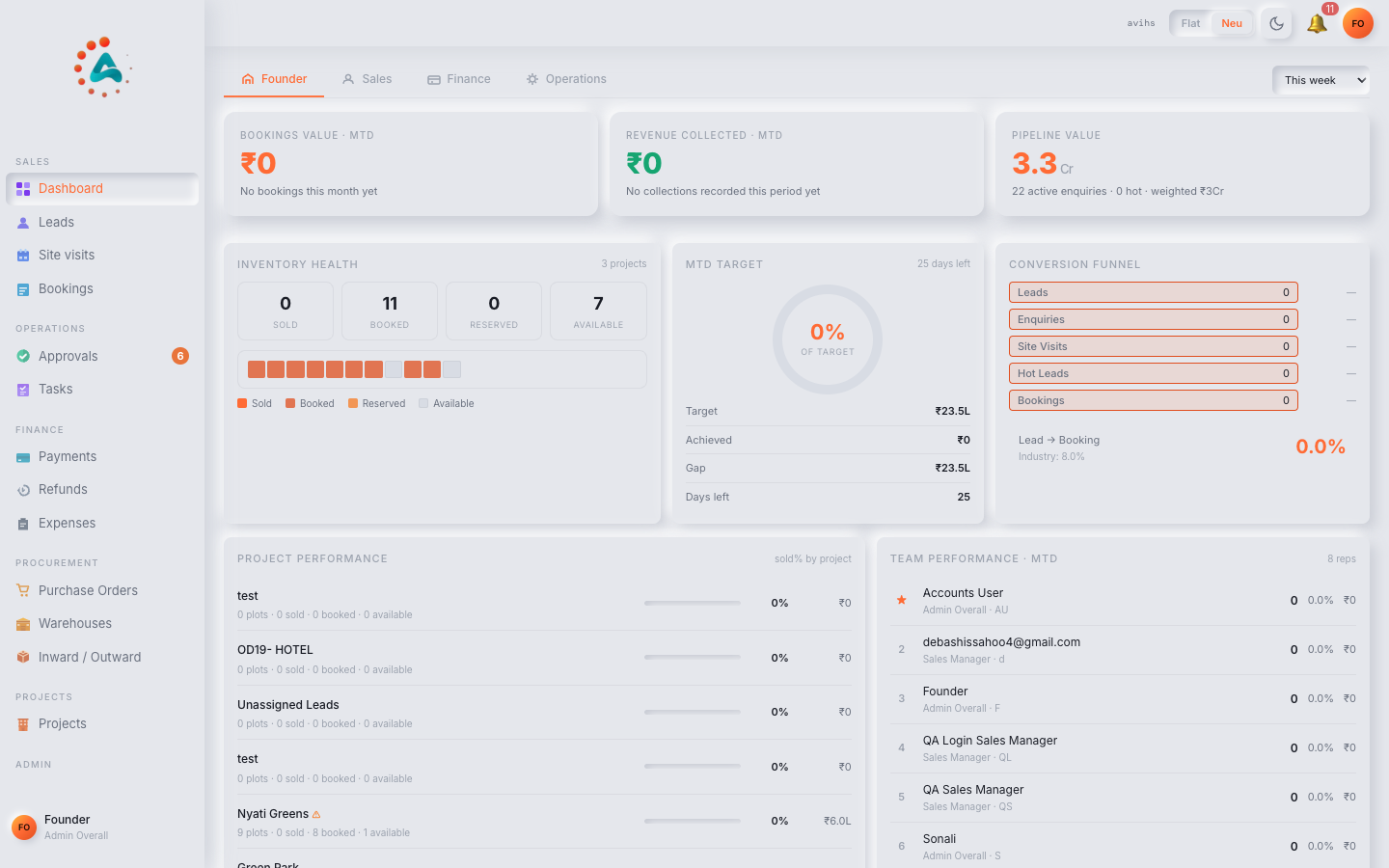 Web
Web
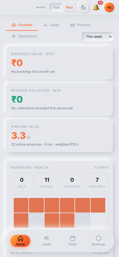 Mobile
2.2 — KPI tiles
The top row of the Home Dashboard is a strip of KPI tiles. Each tile shows a single metric with its value for the selected date range and a comparison to the previous period (shown as ▲ +12% or ▼ −5%). The tiles available depend on your role:
| Tile | What it counts |
|---|---|
| Total Leads | New leads created in the date range (all sources: manual, Meta, WhatsApp). |
| Leads Assigned | Leads with an agent assigned. Unassigned leads are a gap risk. |
| Follow-ups Due | Scheduled follow-ups falling due today or overdue. Clicking opens the follow-up list. |
| Site Visits | Site visits completed in the date range. |
| Bookings | Bookings created in the date range. |
| Collections | Payments received from customers in the date range. |
| Pending Approvals | Expense, PO and booking approvals waiting for action from the current user. |
Tiles with an underline are clickable — they take you directly to the filtered list (e.g. clicking Follow-ups Due opens the leads list filtered to overdue follow-ups).
2.3 — Pipeline chart
Below the KPI strip, the Lead Pipeline chart shows how leads are distributed across stages: New → Contacted → Site Visit Scheduled → Visit Done → Booked → Lost.
- The bar for each stage shows the count of leads currently at that stage.
- Hover over a bar to see the count and the percentage of the total.
- A narrow Conversion rate figure between stages shows the drop-off: e.g. 62% of Contacted leads moved to Site Visit Scheduled.
- The project filter (top-right) scopes the funnel to a single project or shows it across all projects.
2.4 — Activity feed
The right column of the Home Dashboard shows a live Activity Feed — a reverse-chronological list of recent events in the workspace: new leads, bookings created, payments recorded, approvals completed. Each entry shows the event type, the record it relates to (a link), the user who triggered it, and the time. The feed refreshes automatically.
Sales Dashboard
The Sales Dashboard is designed for sales managers and team leads. It shows performance across agents, conversion through the pipeline, and which leads are at risk of going cold.
3.2 — Team performance table
Dashboard › Sales opens with a Team Performance table — one row per agent — for the selected date range and project filter. Columns:
| Column | What it shows |
|---|---|
| Agent | The sales agent's name and profile picture. |
| Leads Assigned | Leads assigned to this agent in the date range. |
| Contacted | Leads the agent has moved out of New (first contact made). |
| Visits Done | Site visits completed by leads assigned to this agent. |
| Bookings | Bookings closed by this agent. |
| Conversion % | Bookings ÷ Leads Assigned, as a percentage. |
| Overdue Follow-ups | Follow-ups past their due date that are still open — a workload health indicator. |
| Avg. Response Time | Average time from lead creation to first status change (first contact). Shorter is better. |
Click any agent row to drill into that agent's individual view.
3.3 — Per-agent view
Clicking an agent's row opens their individual dashboard. It shows the same KPI tiles as the team table but scoped to a single agent, plus:
- Lead list — every lead assigned to the agent in the date range, with status, last activity date and next follow-up.
- Stage-by-stage funnel — the pipeline chart for this agent only, showing where leads are stalling.
- Follow-up calendar — a week view of the agent's scheduled follow-ups. Overdue items are highlighted in red.
- Booking list — bookings closed by this agent, with project, plot/unit, and booking value.
Use the ← Back to team link (top-left of the agent view) to return to the team table.
3.4 — Conversion metrics
The Conversion tab (within the Sales Dashboard) gives a deeper breakdown of funnel conversion:
| Metric | Formula | Good range |
|---|---|---|
| Lead-to-Visit rate | Visits scheduled ÷ Leads assigned | Depends on project; watch trends. |
| Visit-to-Booking rate | Bookings ÷ Visits done | Higher is better; < 5% may indicate a site or pricing issue. |
| Lead-to-Booking rate | Bookings ÷ Total leads | Overall funnel efficiency. |
| Avg. lead age (open) | Days since creation, averaged across open leads | Rising age = leads going cold. |
| Lost reason breakdown | Count of Lost leads by reason tag | Identifies top-of-funnel vs price vs competitor issues. |
Founder Aggregates
The Founder view (visible to Admin and Founder roles) rolls up numbers across every project — revenue booked, collections received, inventory sold, and expense burn — in one place.
4.2 — Revenue summary
The Revenue section shows the financial position of every project side by side:
| Metric | What it shows |
|---|---|
| Total Inventory Value | Sum of listed prices across all plots / units in the project. |
| Booked Value | Sale value of booked plots / units — committed revenue. |
| Collected | Payments actually received from customers against bookings. |
| Outstanding | Booked Value minus Collected — money still owed by customers. |
| Available Inventory | Count and value of plots / units not yet booked. |
A bar chart below the table shows each project as a grouped bar: Booked Value versus Collected. The gap between them is the outstanding collection balance.
4.3 — Project health
The Project Health panel gives a per-project status grid. Each project appears as a row with the following indicators:
| Indicator | Meaning |
|---|---|
| Inventory status | % booked vs available, shown as a progress bar. |
| Collection health | On track if collections match expected schedule; Overdue if payments are late. |
| Budget burn | Development budget consumed vs total — see Projects › Development / Budget for the detail. |
| Lead pipeline | Open leads assigned to this project — a leading indicator of future bookings. |
| SR readiness | Sale-readiness gates: how many have been cleared vs total required. |
4.4 — Collections view
The Collections panel is the financial operations view. It shows expected vs received payments across all active booking payment schedules:
- Due this month — total of payment instalments scheduled to be collected in the current calendar month.
- Collected this month — payments actually recorded against those instalments.
- Overdue — instalments past their due date with no payment recorded. Each overdue item links to the booking detail.
- Upcoming (next 30 days) — instalments due in the next month, so the finance team can follow up in advance.
Reports
Reports are detailed tabular views of the underlying data — more rows, more columns, and full export support. They are designed for analysis and audit, not daily monitoring.
5.2 — Leads report
Reports › Leads lists every lead in the workspace with all its fields visible. Columns include:
| Column | What it shows |
|---|---|
| Lead ID | Unique reference (e.g. L-0042). |
| Name / Contact | Lead name, phone, and email. |
| Source | Where the lead came from — Manual, Meta (Facebook/Instagram), WhatsApp, or Referral. |
| Project Interest | The project the lead is interested in. |
| Assigned To | The sales agent. |
| Stage | Current pipeline stage. |
| Created | When the lead entered blink i. |
| Last Activity | Date of the most recent note, call, or status change. |
| Next Follow-up | Scheduled follow-up date; blank if none set. |
| Lost Reason | Populated for leads marked Lost. |
Filter the report by date range, project, source, agent, or stage using the filter row above the table. All active filters are shown as chips and can be removed individually.
5.3 — Bookings report
Reports › Bookings lists every booking with its financial and status detail:
| Column | What it shows |
|---|---|
| Booking ID | Unique reference (e.g. BK-0018). |
| Customer | Buyer name and contact. |
| Project / Plot | The project and the specific plot or unit booked. |
| Booking Date | When the booking was created. |
| Sale Value | Agreed sale price. |
| Collected | Total payments received so far. |
| Outstanding | Sale Value minus Collected. |
| Status | Pending Approval Approved Cancelled |
| Agent | Sales agent who closed the booking. |
5.4 — Finance report
Reports › Finance covers the three financial sub-reports:
- Payments received — every customer payment recorded in the date range, with booking reference, customer, project, amount, payment mode and date.
- Expenses — all expense records with category, project, vendor, amount, status, and clearance state. Matches what is visible in Finance › Expenses.
- Purchase Orders — all POs with vendor, project, SKU count, total value, approval status and inward state. Matches Procurement › Purchase Orders.
Each sub-report has its own set of filter chips and an Export CSV button (top-right) to download the filtered data.
Filters & Export
Every dashboard and report page shares the same filtering controls. Learn them once and they work everywhere.
6.1 — Date range & project filter
The top-right corner of every dashboard page carries two controls that apply to the entire page:
| Control | Options |
|---|---|
| Date range | Quick presets: Today, This week, This month, Last 30 days, This quarter, This year. Or pick a custom start and end date from the calendar picker. |
| Project | All Projects (default) or a single project from the dropdown. Scopes every tile and chart on the page to that project. |
Report pages have additional inline filters — a filter row above the table with dropdowns for agent, source, status, and other fields relevant to that report. These filter only the table, not the KPI tiles above it.
6.2 — Exporting data
The Export CSV button (top-right of each report page) downloads the currently filtered and visible rows as a comma-separated file. What you filter is what you export — use the filters first to narrow down the data, then export.
- Exports include all visible columns in the order shown on screen.
- Hidden columns (e.g. internal IDs) are not exported.
- Large exports (thousands of rows) may take a few seconds to generate.
- The filename includes the report name and date range, e.g.
leads_2026-07-01_2026-07-31.csv.
Reading the numbers
A quick reference for the metrics that appear most often — what they measure and what to watch for.
-
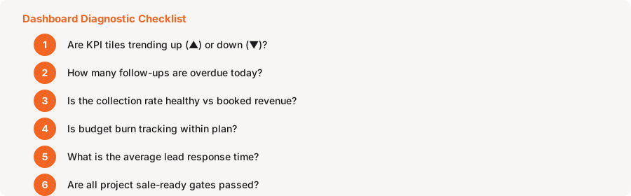
KPI tile comparison arrows — the ▲ and ▼ beside a tile value compare the current period to the immediately preceding period of the same length. A rising bookings count with a rising lead count is healthy; rising bookings with a falling lead count may indicate the pipeline is thinning.
-
Overdue follow-ups — any number above zero means leads that were supposed to be contacted have not been. The longer the overdue tail, the greater the risk of leads going cold. Aim to keep this at zero by end of each working day.
-
Collection health — On track means the customer's payment schedule is being met. Overdue means at least one instalment is past its due date with no payment recorded. Follow up with the customer and record payment once received to clear the flag.
-
Budget burn — if a project's burn reaches 80 %+ before the project is complete, review the Development / Budget tab in detail. Individual expense items close to or over budget are shown in red there.
-
Avg. response time — on the Sales Dashboard. A rising average means leads are waiting longer for first contact. Industry best practice is to contact a new lead within the hour. Alert your team if this metric climbs.
-
SR readiness gates — on the Project Health panel. Each gate cleared means the project is closer to being sale-ready. A project with no bookings but incomplete SR gates may not yet be eligible for booking — check the project's Readiness tab.
Data in blink i is live — there is no end-of-day batch. Any record created, updated or approved anywhere in the workspace is reflected in dashboards and reports within seconds.